For the latest university project we were asked to produce a cover and 2 double pages for 4 different tales by Hans Christian Andersen.
Fairy Tales have always been a huge inspiration to me and my work so I loved every second of working on this project. Even though I would have enjoyed it more to focus completely on one tale and illustrate the whole thing instead of just interpreting certain parts of four different ones...
Anyway, I learned a whole lot during working on these and am now more certain than ever before that picture books really are what I want to create as an artist. They offer so much expressive freedom and creative choices - it's wonderful.
I'll show you some of the work in progress and also include extracts from the evaluation I had to write, which maybe shed some light onto the thoughts that went into every single illustration.
(For this evaluation we had to write about our own work in the third person so don't wonder why it sounds so stiff now and then..)

Quite
like picture books themselves, the tales of Hans Christian Andersen
also suffer from the common misunderstanding that they are aimed at
young children and in fact, have become very “simple children's
fables (…) in all too many translated editions, retellings, and
media adaptations.” (Feng, 2009). In their original Danish versions
they are “far more sophisticated and multi-layered” (Ibid.),
which is something the illustrations created for this brief were also
supposed to be, in order to add more depth to the English translation
and to create another layer on which to find clues for interpreting
the tales.


(...) Words
and images in most successful contemporary picture books work
actively together to create the book's impact - they collaborate by
“filling each other's gaps, or, of even greater significance,
compensating for each other's insufficiencies” and therefore
presenting a ”unique challenge and opportunity in their treatment
of spatiality and temporality.” (Nikolajeva and Scott, 2001,
p.139). The text no longer serves an “auxiliary role” (Shulevitz,
1985, p.15) but is equally important as the image and should make as
little sense read without the illustrations as those should make
without the text. On top of that “the
best, most lasting books seem to be the ones where the picture book
maker (…) leaves space between word and image for the imagination
to roam.” (Salisbury, cited in Klanten and Hellige, 2012, p.158).


Unfortunately
this was an area unable to explore further within the constrains of
this project, since Andersen's tales are so very descriptive and
detailed on their own and do not require illustrations to fill in any
gaps. It was, however, attempted to create visuals which are not
merely decorative or repetitive of the text, rather adding a new
dimension to it that might not be necessary to understand the
narrative but that encourages another interpretation of the seemingly
obvious actions.


For
the second double spread illustrating 'The Snow Queen' for instance,
the abduction of little Kay by the Snow Queen's majestic sledge, as
it is described in the narrative, was not chosen to be depicted on
the accompanying illustration. Instead the image shows a boy setting
out on a quest for knowledge by himself. He is leaving his home and
family behind, while the 'Snow Queen' is only a part of his
subconscious, created by a monotonous day to day routine, which is
symbolized by her consisting of the smoke – the 'refuse' - rising
from his home town's chimneys. While this is only the visual
interpretation of the illustrator, it is supposed to challenge the
reader/viewer to look at the written word from a different
perspective in order to find their very own interpretation in-between
the lines of the text.


(...) The
illustrations created for this project make conscious use of the
elements the picture book as a medium provides. One of them is the
“superior ability” pictures naturally have to “convey the
spatial position of the character, and especially the mutual spacial
relationship of two or more characters, which often reveals their
psychological relationship and relative status.” (Nikolajeva
and Scott, 2001, p.83).
The
first double spread for 'The Snow Queen' exemplifies this. The boy
Kay is moving away from his once beloved friend Gerda who, in turn,
almost appears to be 'dragged' in the opposite direction. He is
literally walking out of their intimate, shared world on the roof top
by leaving the framed image and moving inside the white margin of the
page.
Another
device this double page makes use of is the relationship between the
facing pages, which is an important compositional detail. “In a
good picture book, the creator uses the tension between verso and
recto to imply movements as well as temporal and causal relations.”
(Nikolajeva and Scott, 2001, p.150). They can either cooperate or
contradict each other, in this case they do the latter by
illustrating the different perspectives from which both children view
the world around them. The gutter of the spread almost aligns with
the gutter between the two touching roofs – we find the same
elements on both sides but on the boy's these are distorted due to
the splinter he received in his eye.


Picture
books also are “different
from works of art in their composition, since every picture in a
picturebook (except perhaps the last one) is supposed to encourage
the viewer to go on reading.” (Nodelman, cited in Nikolajeva and
Scott, 2001, p.152). A good way to achieve this is by including a
so-called 'page turner' – a detail,
verbal or visual, that encourages the viewer to turn the page and
find out what happens next.
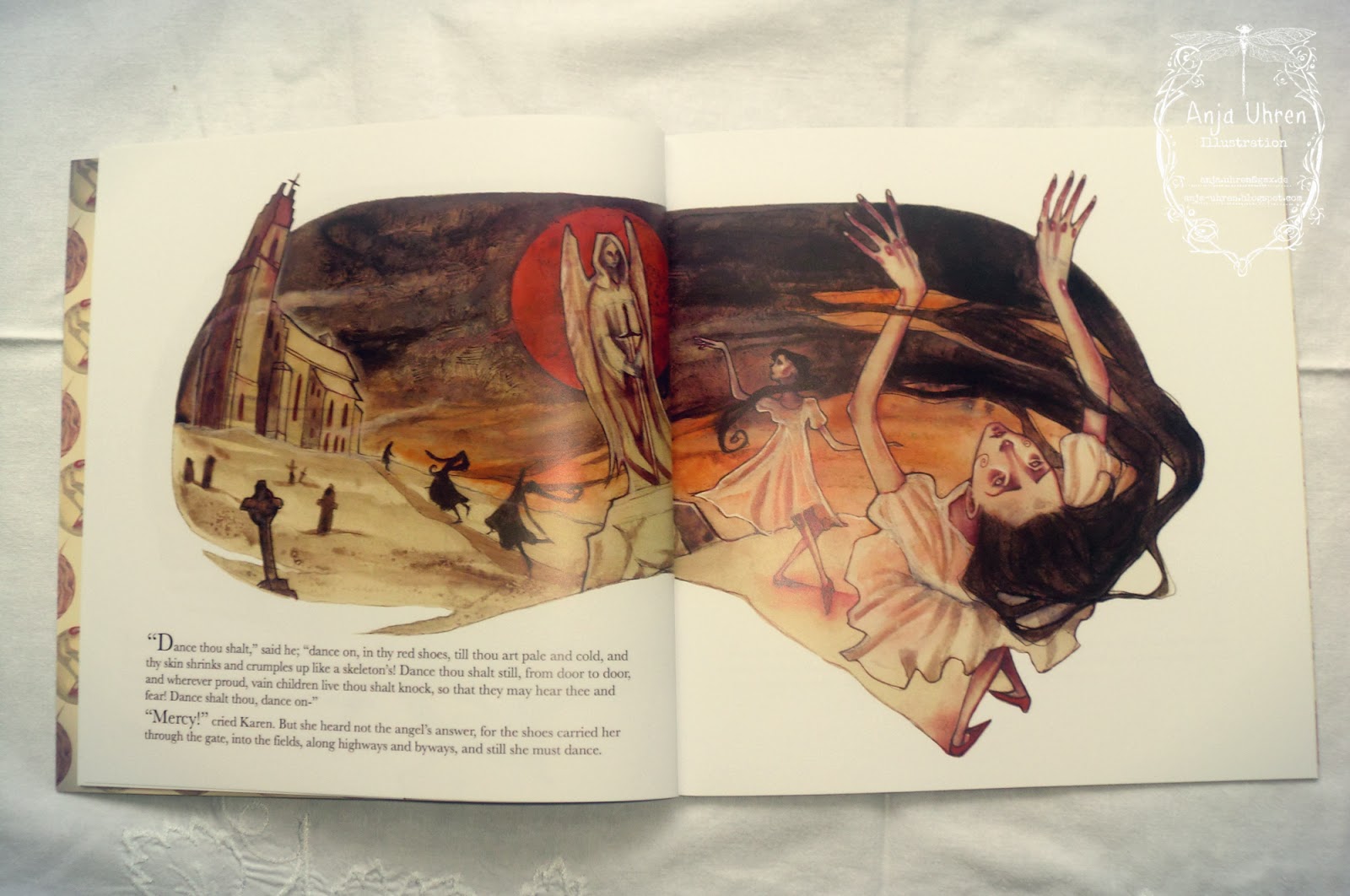
In
the first double spread for 'The Red Shoes' we find such a page
turner in the feet that are seen on the far right side of the recto,
literally leaving this page and intriguing the viewer to follow them.
We
also find 'simultaneous succession' on both double page illustrations
for 'The Red Shoes', which is the depiction of the same character
several times on the same page, suggesting a sequence of separate
moments and conveying movement and thus the flow of time. “Like
blurs and motion lines, simultaneous succession is a narrative
convention that has to be decoded by the viewer” (Nikolajeva and
Scott, 2001, p.140) and can create different effects. In these cases,
it helps to give an impression of uncontrolled movement. The
character is shifted from one position into the next, performing a
bizarre dance she is not able to stop.
The
best device to draw a viewer inside a book is the cover itself. It
was decided upon a circular composition since the nature of the
square format supports this. Andersen's Tales are very close to
nature and many of them feature talking plants and animals.
Therefore, an enchanted forest surrounds the circle containing the
typographic elements.
The
colour palette is deliberately limited, to make sure the visual
details do not overwhelm the written information. You have to look
carefully to make out all the little faces and creatures hidden in
the composition, which hopefully creates interest and serves as a
first interactive viewing experience to draw in the attention of the
viewer. This also is in keeping with the very nature of Andersen's
tales, that challenge you to look closer for hidden meanings and
symbols within them.
The
consideration of the font used for the cover was also very important
since it “occasionally
can affect our understanding of the book.” (Nikolajeva and Scott,
2001, p.245).
Twisted, interwoven vines and twigs were chosen to form the title
'Fairy Stories' and evoke the overall forest theme of the cover as
well as the twisted fates of most stories characters and therefore
help to enhance the book's message.
I hope I was able to give you a little insight in how I work. If you have any further questions, please don't hesitate to ask!
All the best, Anja
Bibliography
Klanten, R. and Hellige, H. (2012).
Little Big Books: Illustrations for Children's Picture Books.
Berlin: Die Gestalten Verlag GmbH & Co.
Nikolajeva,
M. and Scott, C. (2001). How Picturebooks work.
Oxon: Routledge.
Shulewitz, U. (1985). Writing with
Pictures – how to write and illustrate children's books. New
York: Watson-Guptill Publications.


